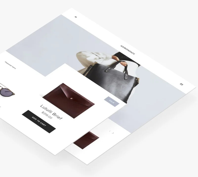
Re-designing a client’s homepage
With a fresh pair of eyes on the client’s website, I was able to create an engaging and directional site for the luxury, restoration brand. This new design has increased revenue.
Areas of focus
• Moving Image: The preferred visual mode of the primal brain is movement. Shifting the focus towards the consumption of hyper visualisation, we added a sliding banner onto the homepage (above the line) with minimal text and strong images. The bounce rate decreased and the click through rate to the booking page grew.
• USP: We highlighted the benefit of using the brand’s services over others by contrasting scenarios the client over its competitor’s through;
1. Testimonials
2. Outlining the simple 3 step process
3. Highlighting the personal concierge service
• Calls to Action: The brain responds best to clear directions with a beginning and end. We made sure our written content takes the consumer from why they need the service to how they can book quickly. Additionally creating a sense of urgency in this context makes sure the consumer is directed to making the purchase in the moment.
• Empathy: We used photos and testimonials which convey the emotional state we wanted our consumers to feel, this has had a significant effect on the perception of the brand.
• Authority: In a social ecommerce world, consumers often look to people or publications in a position of authority before making a purchase decision. By highlighting that Vogue, Vanity Fair and Country and Townhouse have featured the brand, we were able to verify its services and reputation.